
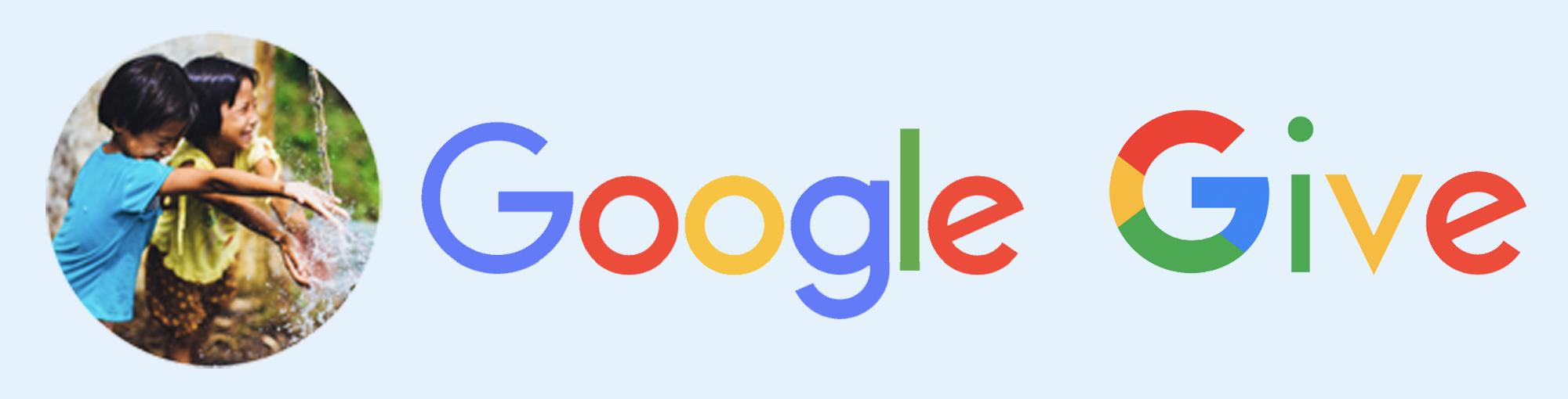
Google Give
A new responsive website for Google.org
BACKGROUND
Challenge: To find a area of interest, discover a problem, couple with brand to solve problem by designing a new product or feature intergration.
Tools: Sketch, InVision, OmniGraffle, screener survey, user interviews, usability testing, affinity mapping, MoSCoW, design studio, Google’s own 5 day Sprint, competitive analysis, technical research, user personas, task & user flow, user journey map, site map, usability testing,
Timeframe: 2 weeks
Deliverables: Hi-Fidelity Prototype, Specification Document, and Client Presentation.
RESEARCH
Multiple research methods were used to first get to know our users. Then once we understood where problems for our users existed, we focused our research on that area to define a problem.
Brand Assesment
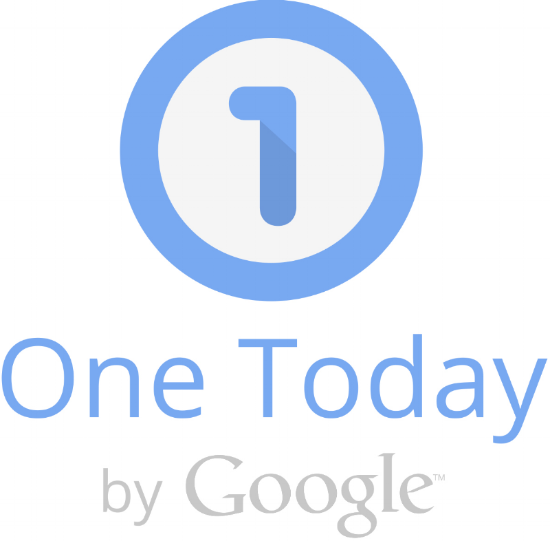
From our research, we discovered that there was already several apps for microgiving(quick and easy monetary donations of small amounts) that were linked to social media as a hook to keep users coming back. Google’s One Today was by far the most advanced and most popular of these microgive apps. But on further investigation, few apps and even less sites were capable of delivering this kind of ease when it game to finding charities that need people to donate time.
Google.org’s mission statement is, “Data-driven, human-focused philanthropy — powered by Google.” They bring the best of Google to innovative nonprofits that are committed to creating a world that works for everyone. Building on the success of Google.org’s OneToday, we though that Google was in the best position to develop a responsive companion website that allows people to easily and quickly donate their time.
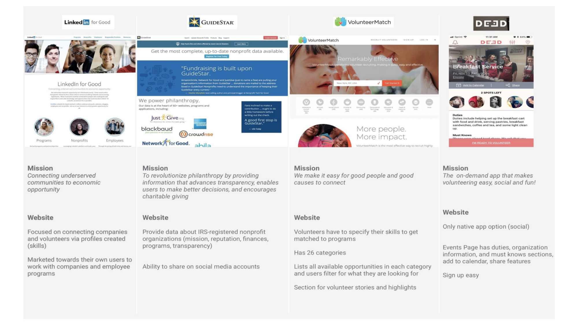
Sample of Current Marketplace for Time Donation Sites/Apps
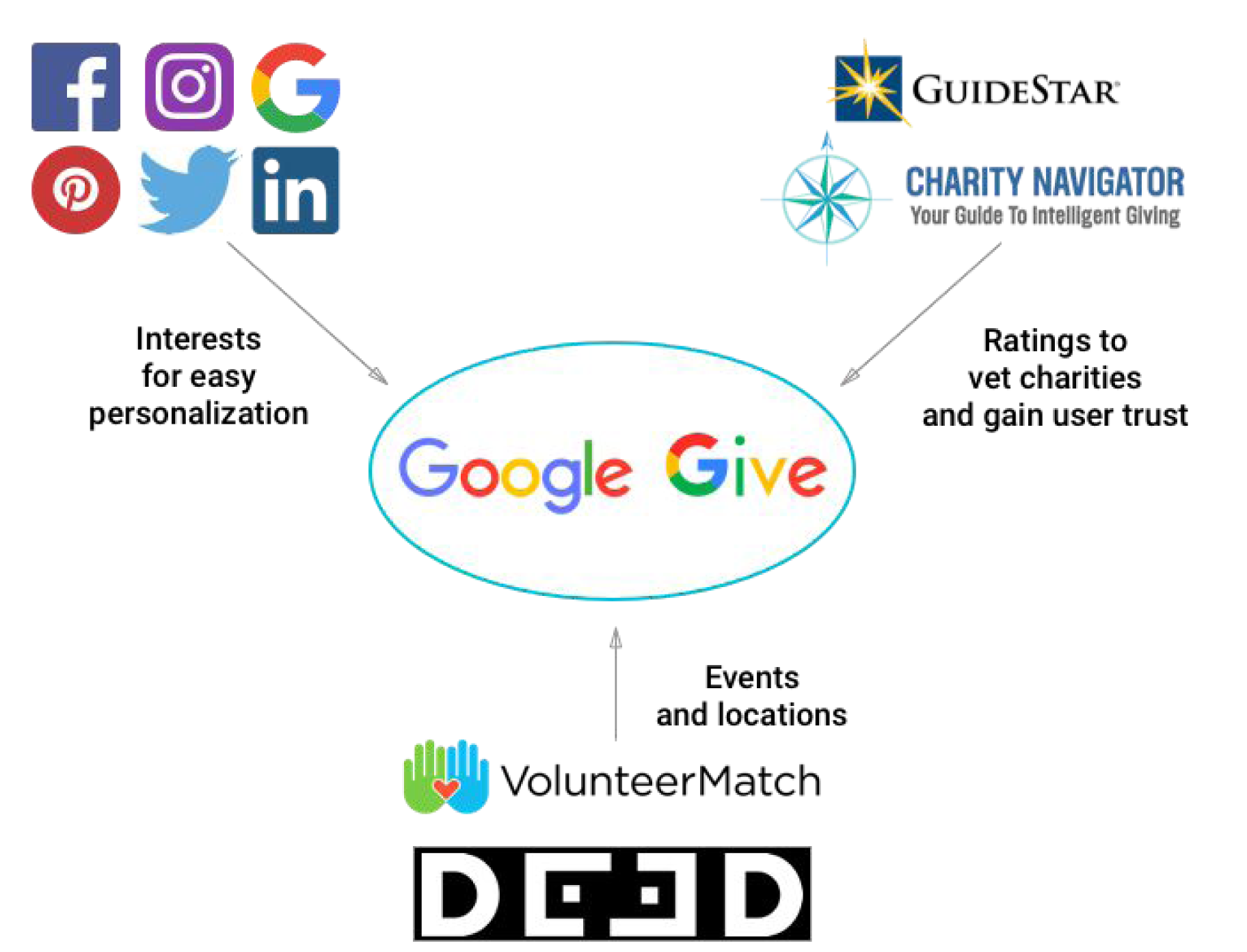
Competitors offer API’s and build-out solutions for their data, so by partnering and using their data, Google Give positions itself at the center of the market.
User Interviews
From our Screener Survey:
-Questionnaire to get an idea of our user base
-Resulted in 24 possible people to interview gave us a view of user demographics and preferences
User Interviews
-Conducted 5 user interviews
-Painted a picture of our users and allowed us to see what inspires people to volunteer
-The data we collected challenged our original assumptions and allowed us to refocus and refine our problem statement
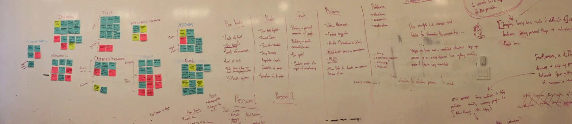
Synthesis
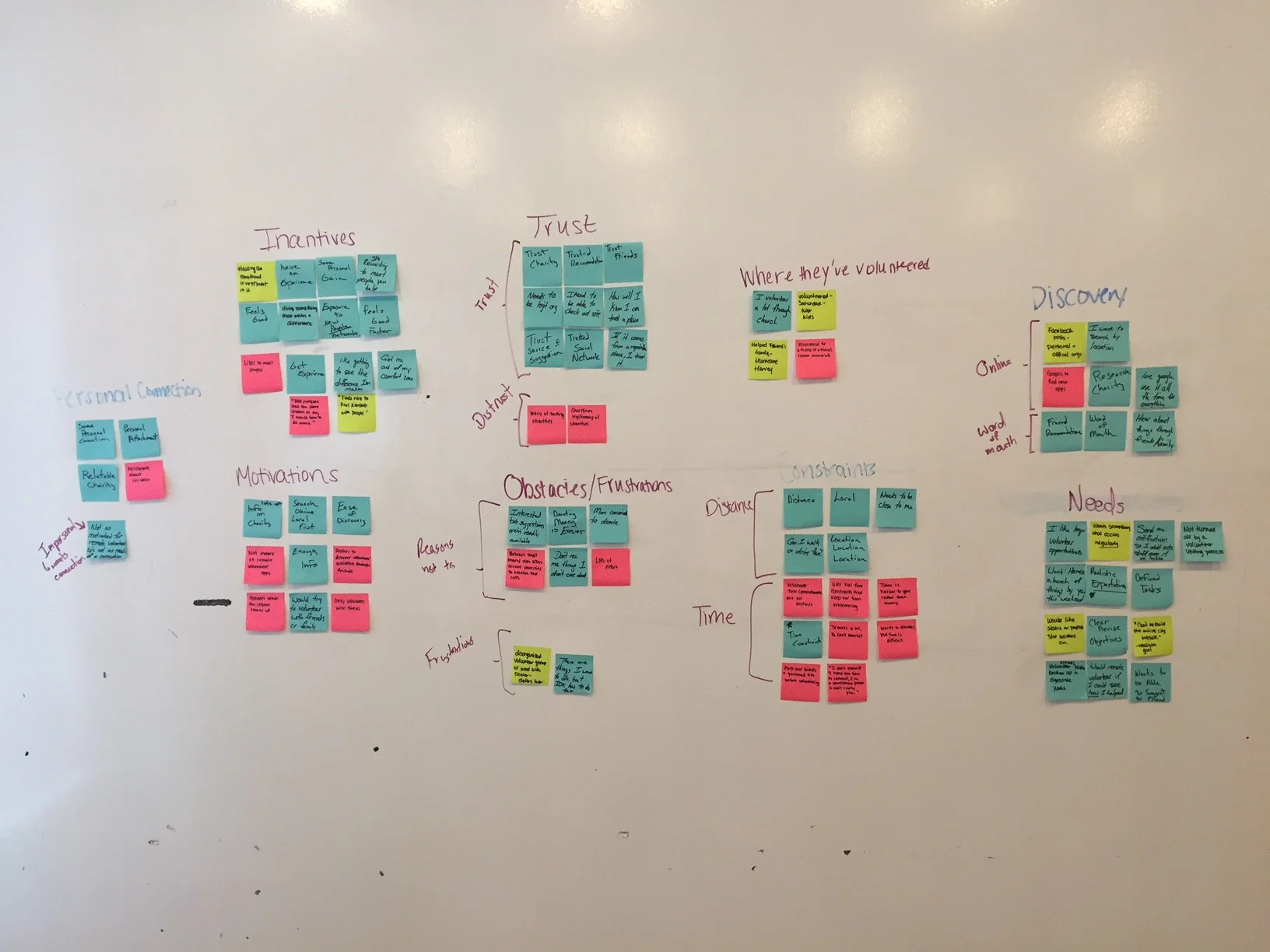
Affinity map of users Needs and Pain Points
User Trends:
Lack of trust in organizations
Limited free time
Overwhelmed by number of options
Users want a personal connection
Desire to combine their social lives with doing social good.
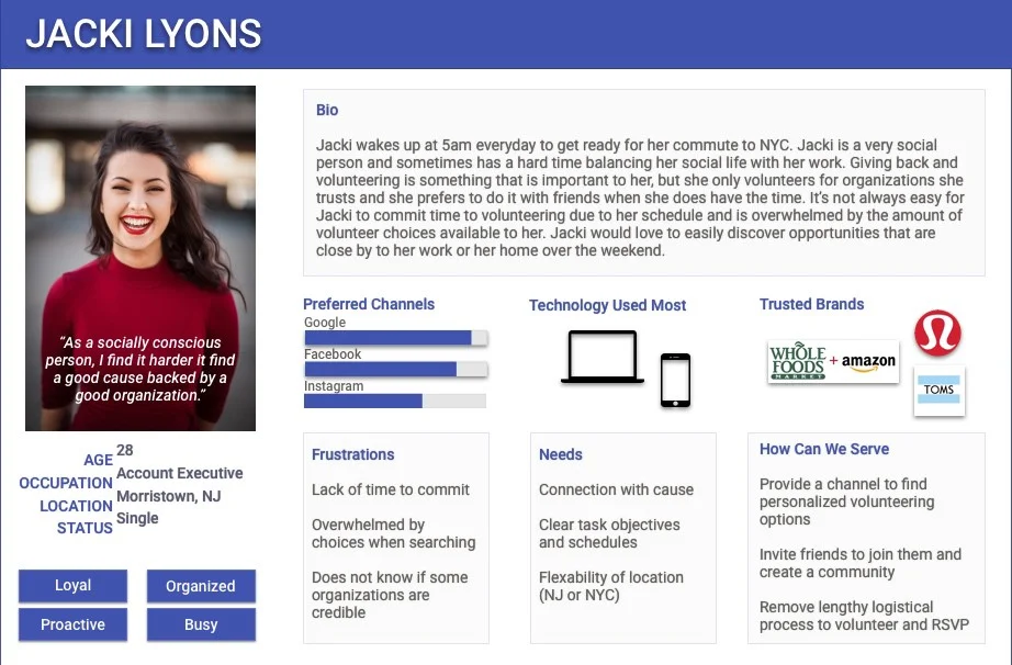
Based on the interviews and the affinity mapping, we were able to construct two personas that were representative of the type of uses we were working with.
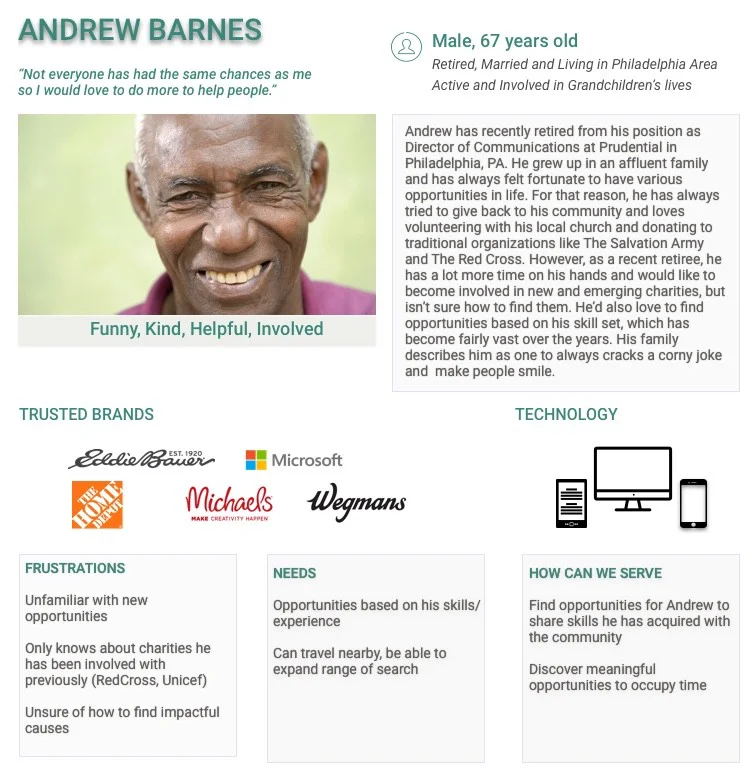
Secondary Persona, Andrew Barnes
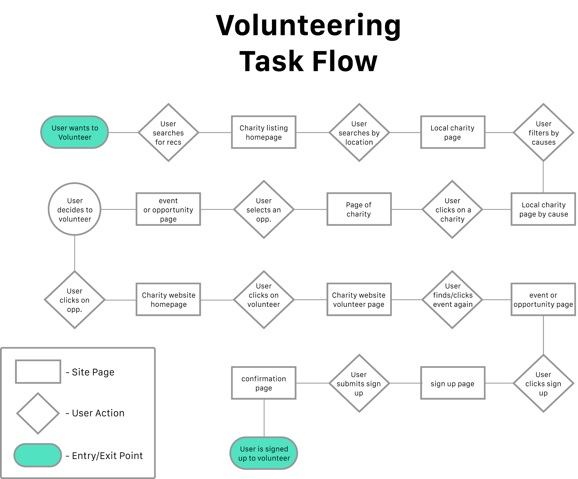
User Task Flow for current marketplace for Volunteering.
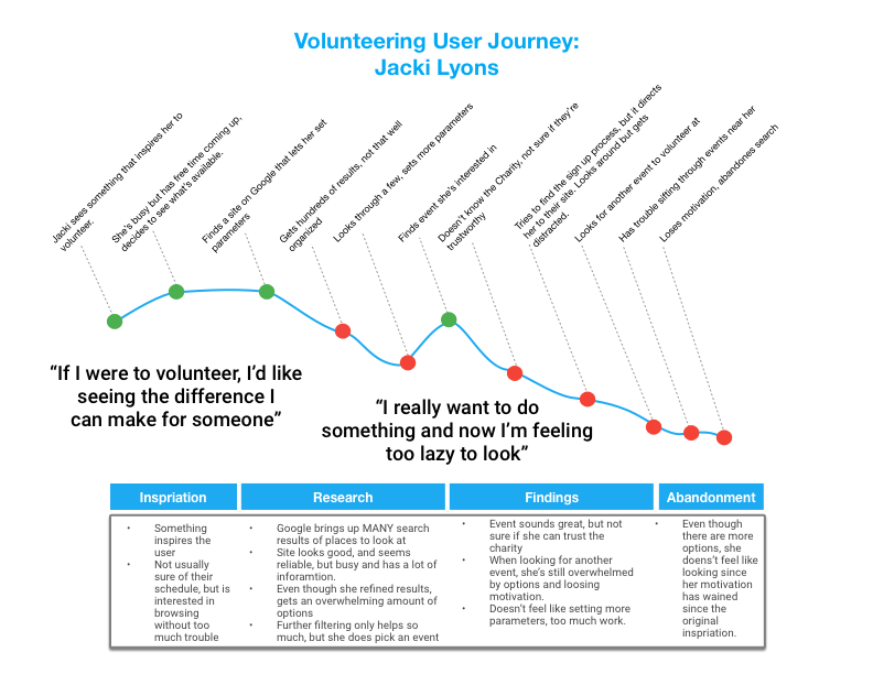
Based on the User Task Flow and our persona’s, we were able to create the User Journey, which actually helped us to actualize and empathize what it took Jacki to volunteer and what might prevent her from doing so. Building on this and other research we were able to define our Problem Statement.
Affinity Map, Components of Persona’s, and Redefined Problem statement.
PROBLEM STATEMENT
With great knowledge of our users, we were able to come back together as a team and redefine our problem statement after learning about our users’ behaviors, needs, goals and pain points. We also recognized that our initial problem statement was tackling many problems, and in this problem statement we are only trying to solve the problem we found most prominent through user interviews.
People lead busy lives, making it difficult to prioritize personal needs, social lives, and doing social good.
Even if someone is interested in volunteering, a convoluted discovery & sign up process deters them from getting involved.
How might we remove digital roadblocks and help empower socially conscious people to successfully volunteer?
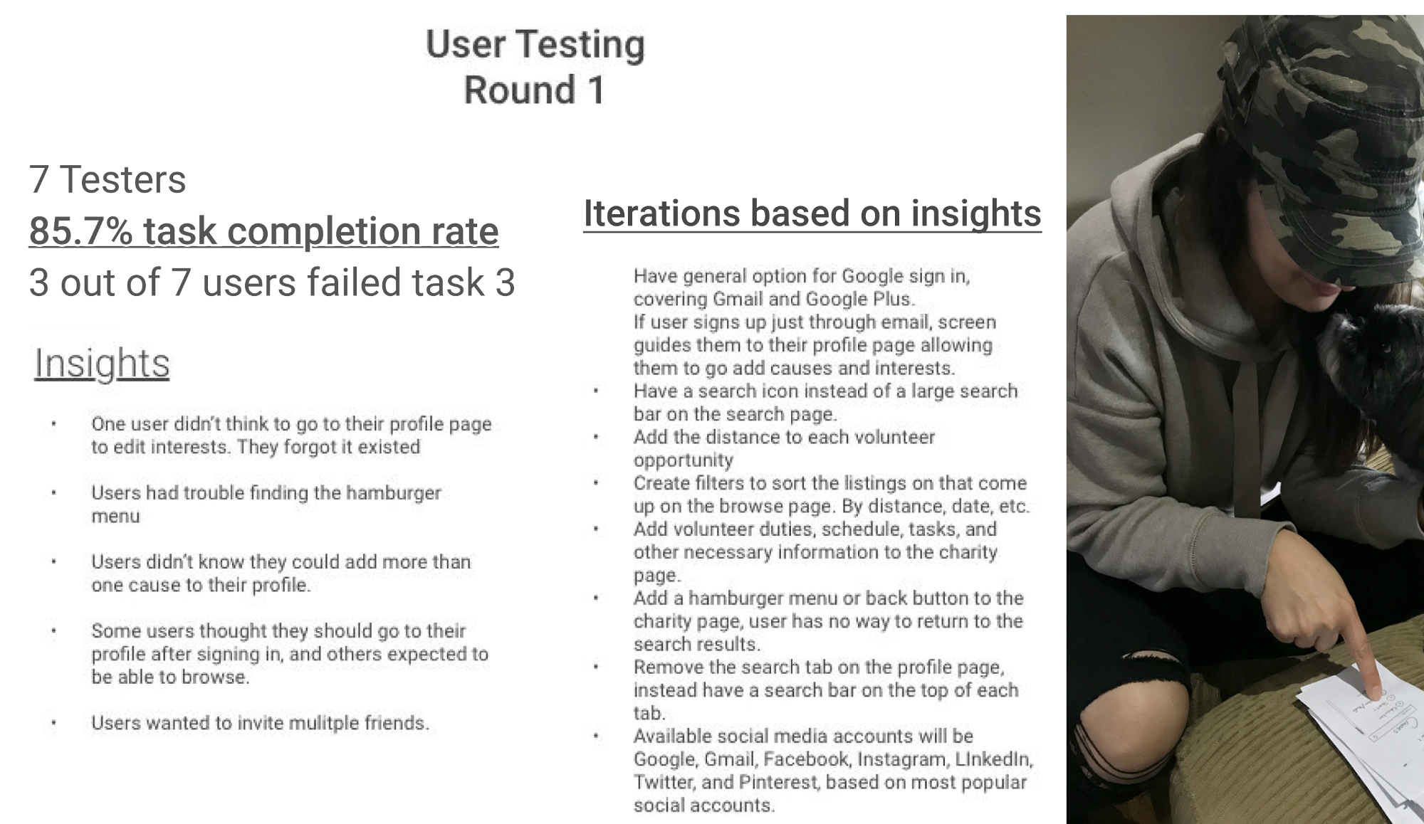
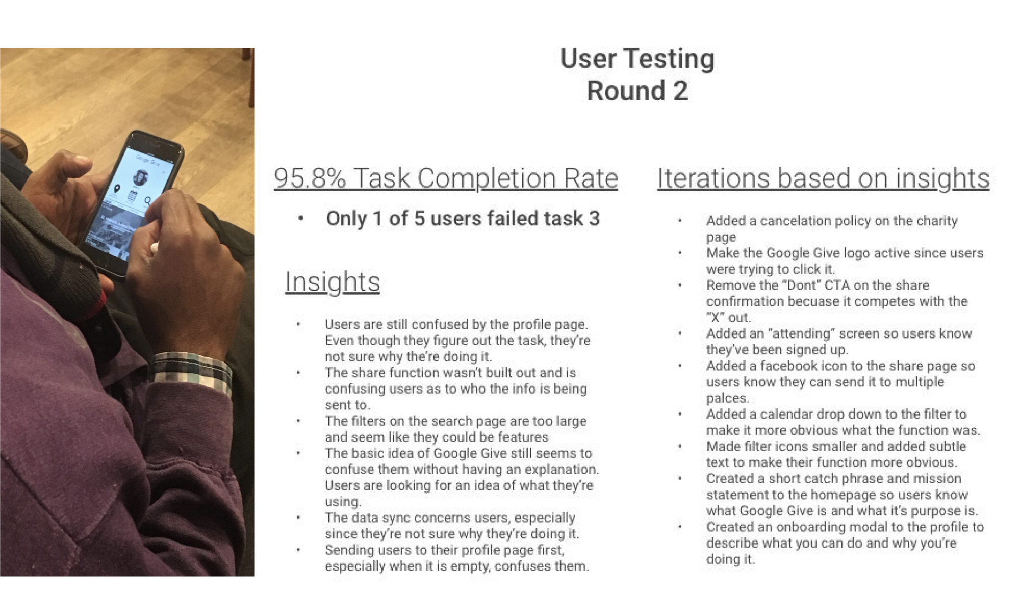
DESIGN & TESTING
We started off the design process with several Design Studios. The first round to produce our list of features.
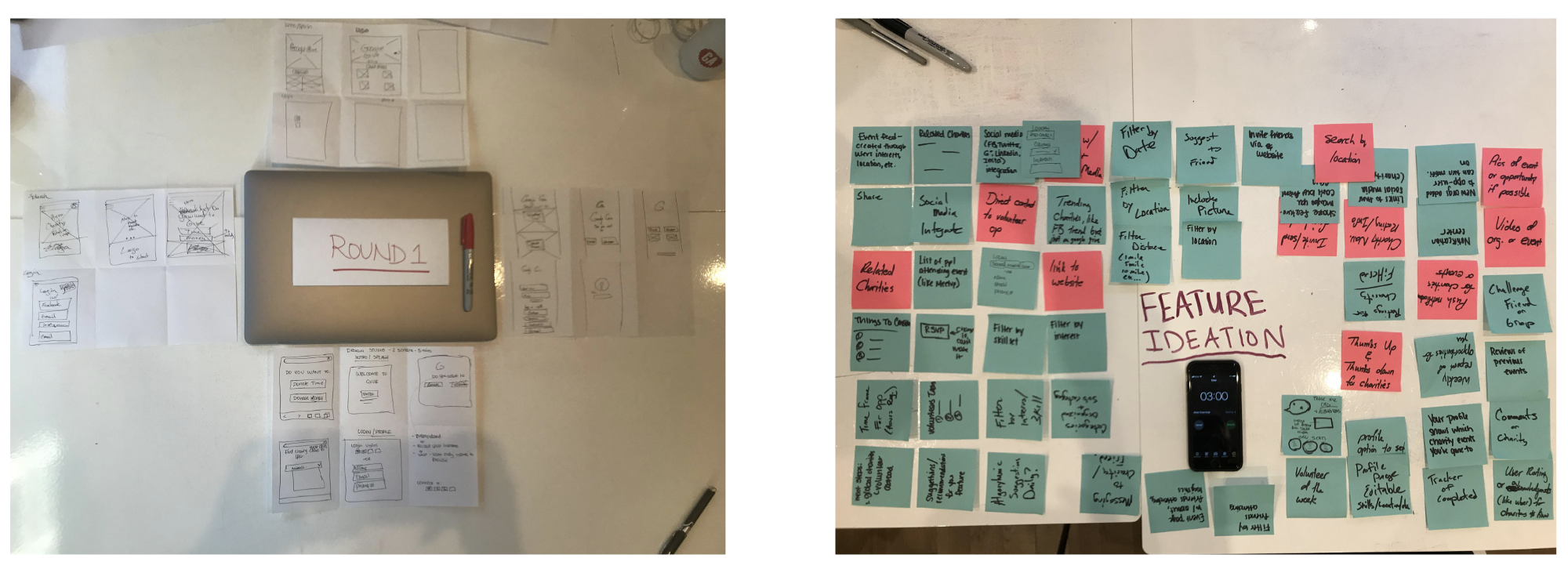
Features created in Design Studio.
Feature Ideation
Once the team had a better idea of who our target user was, we were able to do a “design studio process” for considering different features for our design.
(3 mins) — Feature Ideation Round 1
After doing our first round of features, we presented our feature ideas to the group, and those who had similar or the same feature ideas were grouped together.
(3 mins) — Feature Ideation Round 2
Once we grouped and organized all of our feature ideas, we then did another round feature ideation and then presented our ideas to the group again.
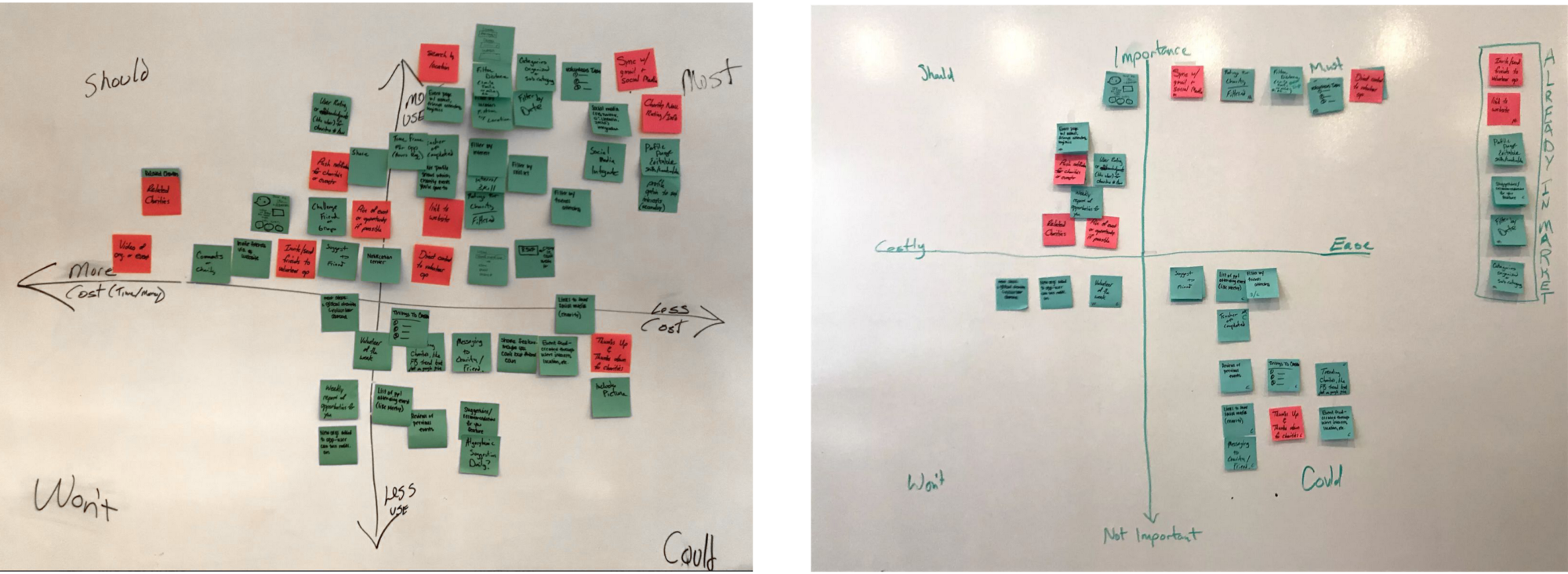
Before and After of our MoSCoW of Features.
We then performed the MoSCoW method in order to prioritize specific features for our users and to learn which features would be designed in this sprint, and which features would be designed and released in later sprints.
Our initial MoSCoW chart below shows many features in must and should. In general, there were many features on the chart, and as a team, we knew we had to consolidate and focus on less features in order to have a successful execution of Google Give. After grouping together duplicates and taking a hard look at the features, we reorganized some, and then were able to come up with the chart on the right.
DESIGN
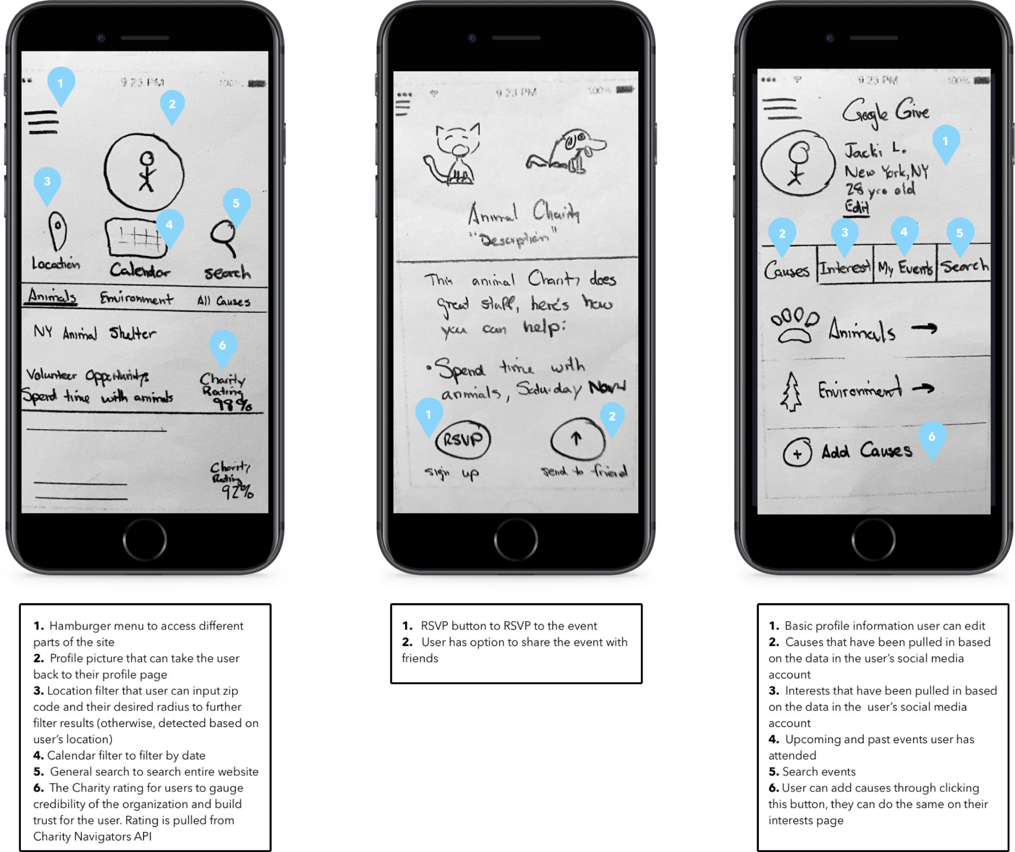
Annotated Paper Prototype
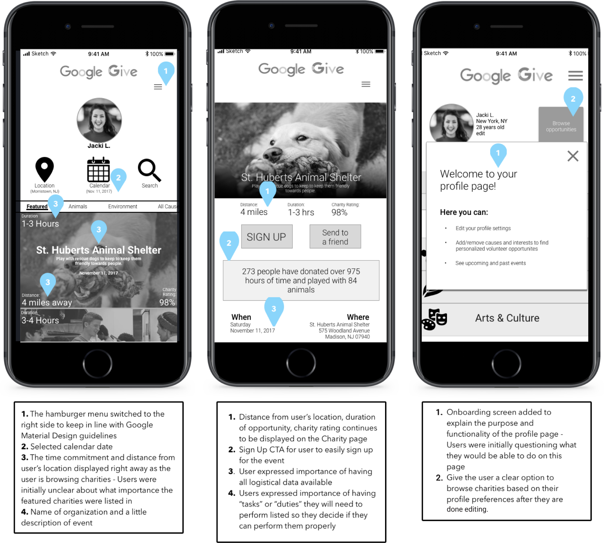
Annotated Mid-Fidelity prototype
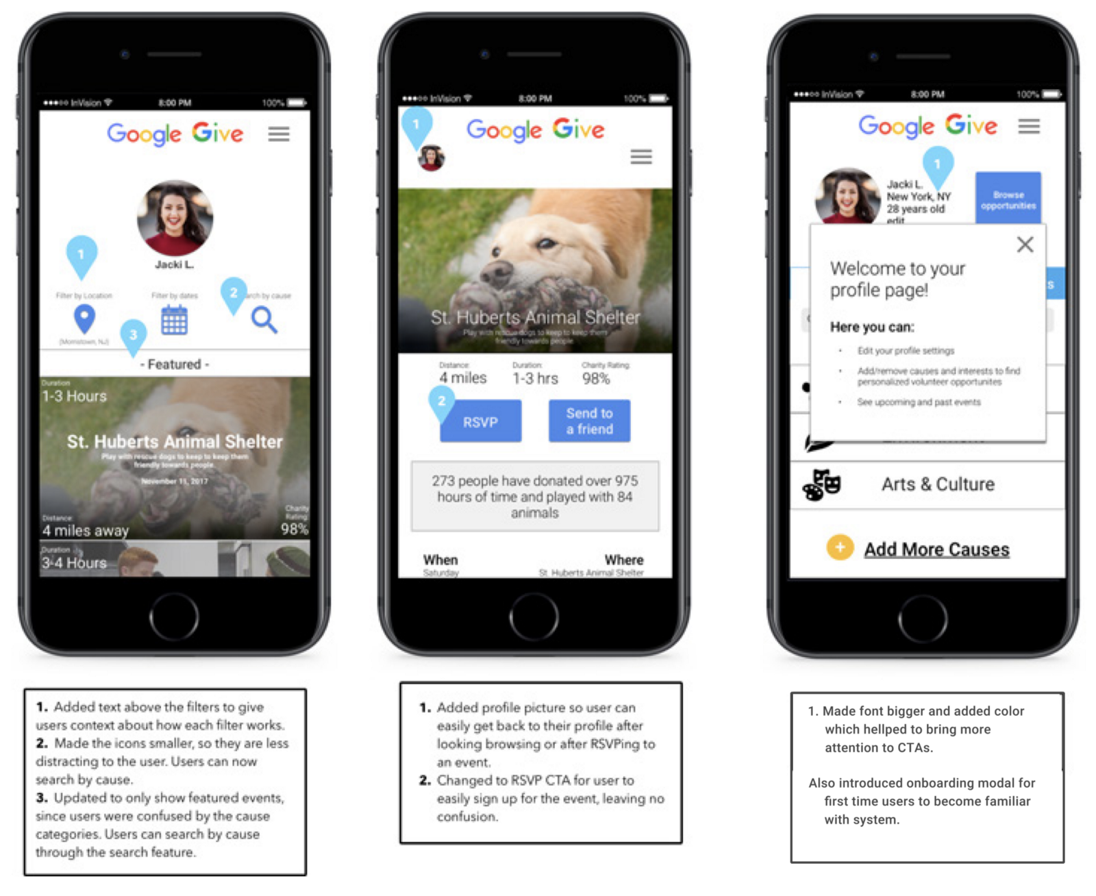
Annotated Hi-Fidelity Prototype — Responsive Website shown on an iPhone.
Next Steps
Features:
Event logistics: which friends of yours are going? How many spots are left?
User-based rating system for charities
Push notifications for upcoming RSVP’d events or new events/charities
Add a benefits trigger (ie. Star rating for volunteers or hours volunteered rating to post to social media.
Begin research and design phase to for charity organization facing side of website.
Continue to test and iterate based on user feedback