
EATALY
A NAVIGATIONAL REDESIGN
Background
Challenge: To create a responsive redesign of Eataly.com, based around user and stakeholder needs.
Research
Contextual Inquiry: The first stage of our research was to conduct Contextual Inquiry both in Eataly’s Flatiron location and with users of the Eataly.com website, as well as a competitor. We were able to conduct two instore inquiries, one online, and one competitor.

Eataly in the Flatiron District of Manhattan.
Insight: Their needs seem to be met with the in-store experience, however their online experience is not ideal, if they even use the website at all.
Competitive/Comparative Research:

Eataly’s market ecosphere values food, education, and bringing people together.
Key insights from Competitive Analysis of website attributes was that both competitors had easier to find recipe sections, clearer food category organizational structure and better search functionality. In addition, Eataly’s competitors had overall, better buying experience with more product details.
Screener Survey:
We received 21 submissions from the screener survey in recruiting participants for Contextual Inquiries, Usability Testing of Eataly’s current website and Card Sorting.
Criteria: Uses Eataly website and online store OR Uses competitor website and online store
Heuristic Evaluation:
Our extensive heuristic evaluation of the Eataly website confirmed what are other research was turning up, that Eataly’s website was lacking when compared to its competitors.
Usability Testing:
Using the existing website, we tasked users with this scenario:
You are at work and want to look up a few things on your favorite food website:
1. Find a pasta recipe
2. Buy an ingredient from that recipe
3. The holidays are coming, you want to start looking up gift options for 3 different people:
Your pasta loving boyfriend
Your boss
Your Italian nonna
4. Find a cooking class for you and your friend this weekend at the Flatiron location.
Overview
We tested 4 users total. 3 users with Eataly’s website and 1 user with Whole Food’s website.
Insights
1 out of 3 users completed all tasks on Eataly’s website.
When users would search there would be no results.
Not enough filter options.
Card Sorting (Based on existing website)
Insights
- Users created 75% more different categories than Eataly’s existing website.
- 100% of the time users placed “Tomatoes” into Fresh. Currently on Eataly’s website Tomtoes are categorized with Pasta & Pantry.
- Recipes were grouped all together 80% of the time but not in the correct category.
- But recipes were grouped together 100% of the time in the open sort.
- Overall users were grouping items very differently than Eataly’s current navigation.
NOTE: We chose to conduct a Hybrid Card Sort in our 3rd round of user test because of the user feedback we found from our Usability testing, that recipes are hard to find and filter. We wanted to pin point whether users would create a new category or categorize these items under the current categories.
Personas

Our Primary Persona updated based on new user research.

Our SecondaryPersona updated based on new user research.
Problem Statement
Eataly’s customer base values quality foods and great customer experience. Their needs seem to be met with the in-store experience, however their online experience is not ideal, if they even use the website at all.
Maggie wants to find unique and inspiring recipes and buy quality food items through their trusted culinary source, Eataly, however the website experience is difficult to navigate and search. How might we optimize the main navigation structure of Eataly’s website to provide a better experience for their users?
Design & Testing

Before we started redesigns, individually, we did a task flow based on finding a recipe and browsing for an item from that recipe.
This task flow helped each of us find our direction to solve the users issues.
My first iterations on the redesign involved a much reduced main nav, where the food and gift categories would be cleaned up by making them sub categories, thus freeing up the top nav visually.
Users were given the same tasks as were given in the usability testing of the current site
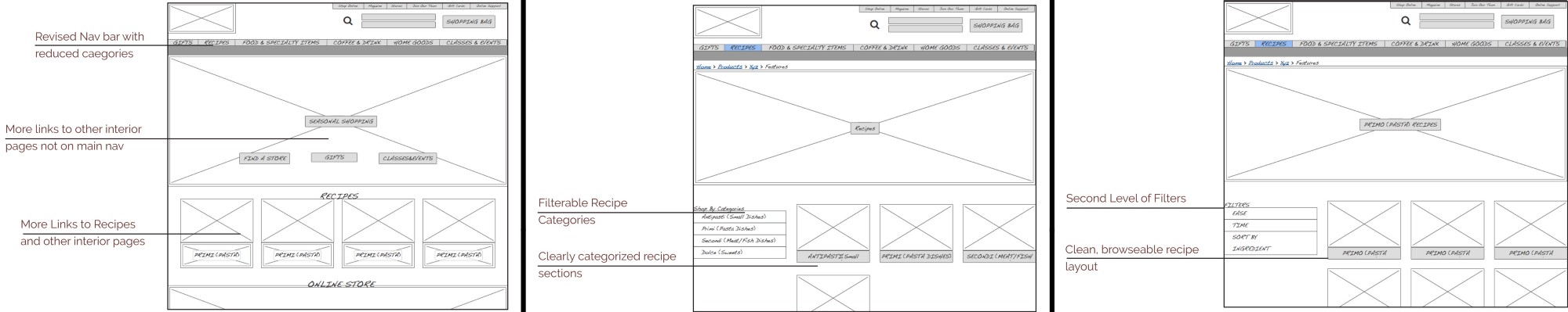
Three annotated screens from the 1st iteration.
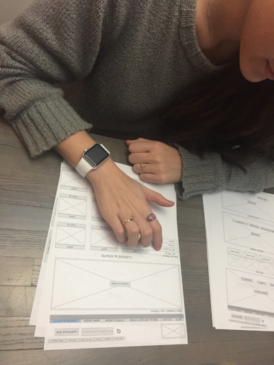
Paper prototyping
Metrics
Average Time: 3 minutes
3 out of 4 users were able to find a suggested recipe using simpler nav bar.
2 out of 4 users were able to find an item from the recipe and then add it to their cart using the navigation system.
1 out of 4 users were able to find an item by browsing the online shopping section.
Insights
Path to recipes is clear via multiple entries, but main nav is still too confusing
Drop down menu options should be more expansive, logical and intuitive.
Continued simplification of nav elements and filtering.
Design & Testing.2
Back to the drawing board. I expanded the nav to have more categories similar to the original nav, but I changed the wording on the nav to correspond more with the categorization we saw in the card sorting.
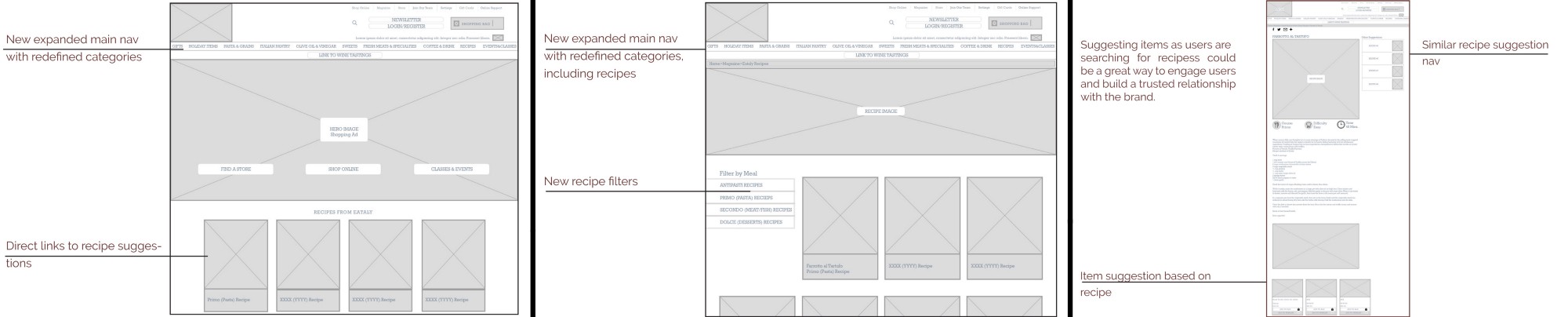
3 annotated screens from the second iteration of the nav bar.
Metrics
Average Time: 3 minutes
5 out of 5 users were able to find a suggested recipe using simpler nav bar.
5 out of 5 users were able to find an item from the recipe and then add it to their cart using the navigation system.
2 out of 5 users were able to find an item by browsing the online shopping section.
Insights
Path to recipes is clear via multiple entries, but again main nav is confusing.
Too many choices of categories.
Nav very crowded now.
Drop down menu options should be more limited, logical and intuitive.
Continued simplification of nav elements and filtering.
Solutions
Return to simplified nav bar with broader, clearer categories
Prototype
A third iteration was created, this time as a mid/hi fidelity prototype. A great deal of Eataly’s original design was kept in this redesign, with minimal changes to elements outside the main nave.
https://invis.io/B5E5AAAQ3

Next Steps
Run more card sortings and A/B testings to isolate best naming
scheme for products currently sold. As the naming scheme stands in my last iteration, I’ve tried to strike a balance between the original brand aspects and the users intuitive categorizations.
Continue to develop and test recipes/item cross suggestion functionality. To implement this type of functionality, would be difficult but would greatly improve the usability and delight of this website. Making it more that what it is currently being used for.
● More refinement on responsive elements for mobile as they are
added to website.